

Continue the hunt for the root cause
Finding the root cause is not a trivial task. Often, seemingly obvious causes of a problem lay far away from the most essential one. The plentiful cluster of qualitative methods for root cause analysis can help a problem-solver identify possible reasons why a poser might happen. Another powerful cluster of quantitative methods naturally supplements qualitative ones and targets to validate and prove assumptions based on formalized mathematical argumentation. The variety of quantitative methods that support the root cause analysis can be split into two major categories:
- graphical analysis, which is based on descriptive statistics and, besides the identification of causes, provides a great visual reinforcement for the further communication process;
- in-depth statistical analysis, that mainly serves as a validator of possible causes identified by other tools.
Graphical analysis
This type of analysis focuses on describing and analyzing the key characteristics of a dataset without generalizing to a larger population. There are plenty of tools (for example, Excel) that allow a problem-solver to produce various illustrations without advanced statistical knowledge. Charts assist in visualizing the numbers and their types are selected based on the purpose of analysis and the message to be conveyed. There are four basic types of graphs:
- bar charts aimed to summarize quantities of different categories;
- histogram charts applied to display the frequency distribution of data points;
- line charts used to show trends over time;
- pie charts assigned to illustrate numerical proportions of the whole.
Graphical instruments have different complexity in creation and understanding. Duly selected charts are valuable add-ons in parsing root causes. Numeric data representing items one can count in separate units without fractional or decimal values, like the number of customers, is called discrete data. They are usually illustrated by Pareto charts, pie charts, and bar charts. Continuous data, which can be measured using a scale and meaningfully split into smaller parts, like temperature, time, or weight, is best visualized in histograms, box plots, and in the form of run and control charts.
Pareto charts
Pareto charts are one of the most well-known and mass-applied tools in problem-solving and decision-making. It is a graphical representation of elements in a ranked bar chart. The main idea behind this is the Pareto Principle, named after Italian economist Vilfredo Pareto, or so-called the 80/20 rule. It stays that 80% of consequences come from 20% of the causes. In other words, a few elements create more impact than all the other causes and a problem-solver can usually identify three to four causes that, if eliminated or improved, will have a crucial impact on the issue.
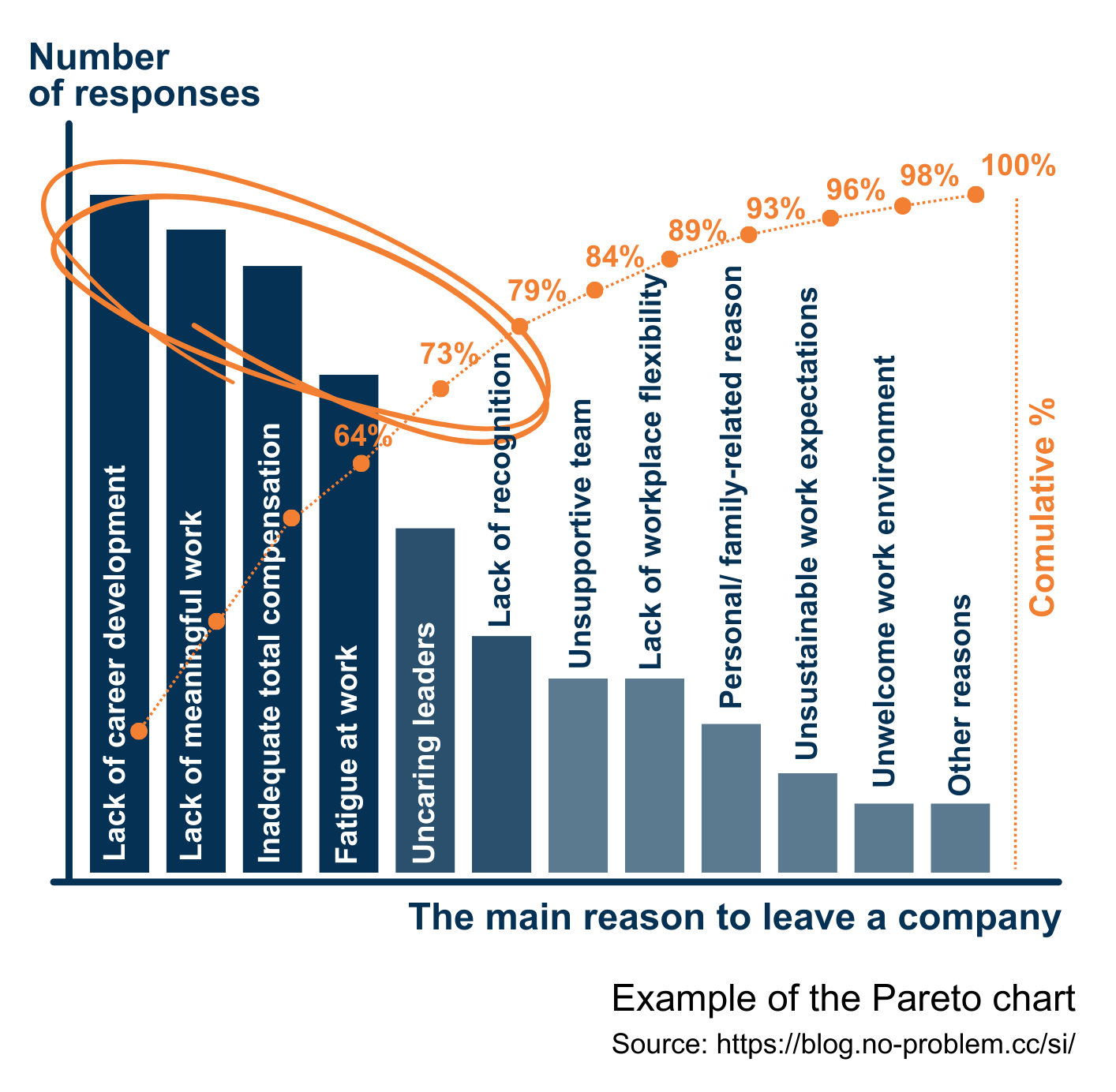 For example, data collected during exit interviews is worth visualizing as the Pareto chart. Among the revealed top causes that triggered employees’ decisions to leave a company, a problem-solver may select one, not necessarily the first on the top, to elaborate an action plan to fix this cause and observe how the situation will develop. The decision in which order to tackle the key causes depends on a variety of factors, like the complexity of the realization, available resources, and so on.
Besides strong analytical support, Pareto charts show complex data in a simple visual format that prevents misunderstanding of presented information and reduces tiptoeing around discovered causes. It allows to narrow an approach for a problem that has multiple causes or is too broad to address in a single change action. This method can be used separately to spot the causes of an issue or be effectively combined with other qualitative and quantitative methods.
For example, data collected during exit interviews is worth visualizing as the Pareto chart. Among the revealed top causes that triggered employees’ decisions to leave a company, a problem-solver may select one, not necessarily the first on the top, to elaborate an action plan to fix this cause and observe how the situation will develop. The decision in which order to tackle the key causes depends on a variety of factors, like the complexity of the realization, available resources, and so on.
Besides strong analytical support, Pareto charts show complex data in a simple visual format that prevents misunderstanding of presented information and reduces tiptoeing around discovered causes. It allows to narrow an approach for a problem that has multiple causes or is too broad to address in a single change action. This method can be used separately to spot the causes of an issue or be effectively combined with other qualitative and quantitative methods.
Box plots
A box plot is a concise way of presenting a dataset by displaying the maximum, the minimum, the average, and the medians of the lower half and the upper half of the dataset. Box plots are often called Box-and-Whisker graphs, where the box is drawn from the median of the lower half to the median of the upper half, the whiskers indicate extremes of the dataset, and the dots are outliers. The line within the box is the average of the dataset.
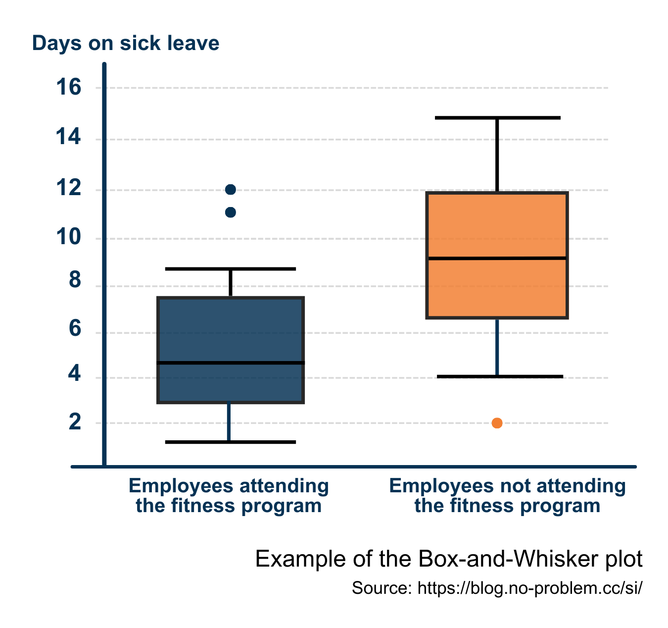 In a given example, the data show days on sick leave of various employees within a period. The results are divided into two categories based on attendance of fitness. Even without further explanation, it can be said that employees who practice sports took on average fewer days on sick leave during the selected period than ones, who did not attend fitness. So there might be a causal relationship between attending fitness programs and the wellness of employees. If a company aims to reduce the average sick leave days of its employees, including fitness programs as a perk in a well-being package can be a solution.
Graphical analysis is useful for gaining an idea about data relationships and is powerful for illustrating findings to others, but in-depth statistical analysis helps to understand relationships with more certainty.
Statistical analysis
Statistical analysis is the process of collecting and investigating large volumes of quantitative data to identify trends, patterns, and relationships and to obtain valuable insights. There are two main statistical methods applied to data analysis: descriptive and inferential statistics. In business analytics and data science, both methods are used to support research, validate theories, and study complex data relationships and entail some statistical computing usually done with the help of specialized software.
Descriptive statistics deals with summarizing, organizing, and meaningfully presenting data of a given dataset. The results of the analysis are conveyed as charts, graphs, or tables, and it goes far beyond the simple graphical analysis mentioned above. The principal focuses of descriptive statistics lay on:
- measures of frequency: count, percent, and frequency;
- measures of central tendency: mean, median, and mode;
- measures of dispersion: range, variance, skewness, and standard deviation;
- measures of position: percentiles, quartiles, and interquartiles.
While descriptive statistics conclude without generalization to a bigger population, inferential statistics aim to apply the results of analysis based on the selected dataset or sample across the entire population. The relevance and quality of the sample are vital for the reliability of conclusions. To get valid results that support the root cause analysis, most times a problem-solver applies the probability sampling method, which utilizes some form of random selection. Depending on the characteristics of the population, one of the four basic probability sampling types is run: simple random sampling, systematic sampling, stratified sampling, or cluster sampling. A sample size must be chosen to accurately represent the population and be sufficiently large to yield statistically significant findings. In a business environment, it should provide a balance between statistical validity and practical feasibility, including constraints of time, budget, and the target population.
Hypothesis testing
Hypothesis testing is a method of statistical inference used to decide whether or not the data rejects a particular assumption and involves a calculation of a test statistic. It makes conclusions about the population based on data from a sample. For example, during a brainstorming session to reveal the causes of a high fluctuation rate of top performers was assumed that the pay-for-performance principle does not work in a company.
To ensure a proper alignment between pay and performance, a company must consider all pay elements: annual base pay, annual incentives, performance-related cash/ shares/ stocks, other equity, and perks. Employees in a company might be entitled to various combinations of pay elements. At the same time, all employees have annual income, and usually, its change is a part of the annual performance review discussion. So, it can be checked if there is a link between the performance results of employees with adjustments of their total annual compensation. Parsing can be done for all employees in small and mid-sized companies, but big enterprises with thousands of employees face time and budget limitations for analysis and cannot examine the whole population. So, to proceed with testing, a reliable sample of 200+ entities is to be constructed. It is worth considering that different job families might have diverse compensation structures (for example, proportions of base and variable pay). Therefore, to get a sample that best represents the entire population, stratification can be applied. In other words, one selects random entities from each job family. Every element in this stratified sample will possess two characteristics.
- an individual performance result assigned to one of the performance categories (usually up to 5 categories, e.g.: needs improvement, partially meets expectations, meets expectations, partially exceeds expectations, exceeds expectations),
- a change in annual compensation compared to the previous year. An adjustment makes sense to measure in percentage because salary levels often have noticeable variations for different locations. Dealing with multiple currencies may require some norming methods to apply.
To start the analysis, the null hypothesis (H0) and the opposite alternative one (Ha) have to be set. Here, the hypotheses can be formulated as:
H0: Individual performance does not affect the change of an individual’s annual compensation.
Ha: Individual performance affects the change in an individual’s annual compensation.
In this example, hypothesis testing can examine distributions of two dimensions: a performance category and a percentage of change in annual compensation. Based on observations of these variables, the null hypothesis of their independence can be checked with a chi-squared test. This procedure leads to the determination whether H0 can be rejected. As the conclusion is based on the sample and not the entire population, there is always some risk of error. A type I error corresponds with the probability of rejecting H0 when the null hypothesis is true (α), and a type II error reflects the probability of accepting the null hypothesis when H0 is false (β). To conduct analysis, a problem-solver specifies the maximum allowable probability of making a type I error, called the level of significance for the test. Common choices for the level of significance are α=0.05 and α=0.01. Another important element in hypothesis testing is the observed level of significance to the test (p-value). It measures how likely it is that any observed difference between groups is because of chance. The p-value is calculated under the selected statistical test and then compared with the chosen α: if the p-value is less than α, the null hypothesis can be rejected, and the statistical conclusion is that the alternative hypothesis is accepted.
Correlation and regression analysis
Regression analysis is the most effective method for constructing a model of the relationship between a dependent variable and one or more independent variables. Various tests are then employed to determine if the model is satisfactory to predict the value of the dependent variable given values for the independent ones. A simple linear regression analysis estimates parameters in a linear equation that can describe the relationship between a single dependent variable (possibly output) and a single independent variable (possibly input) and predict how one variable might behave given changes in another variable. However, the changes don’t necessarily indicate a cause, only that the variables are intertwined in some way. Often, the results of a simple linear regression analysis are presented as a scatterplot with the regression line and the regression function.
Regression analysis is tightly linked to correlation analysis. They both examine the same relationship between two quantitative variables from different angles. Regression investigates a form of the relationship and correlation provides information on the strength and direction of this relationship. The most frequently used is the so-called “Pearson’s correlation” (r). To get it, divide the covariance of two variables by the product of their standard deviations. The Pearson correlation is +1 in the case of a perfect positive (increasing) linear relationship, −1 in the case of a perfect decreasing (negative) linear relationship (so-called, anti-correlation), and some value between −1 and +1 in all other cases, indicating the degree of linear dependence between the variables. As it approaches zero, there is less of a relationship (closer to uncorrelated). The closer the coefficient is to either −1 or +1, the stronger the correlation between the variables. The correlation coefficient measures only the degree of linear association between two variables. Any conclusions on a cause-and-effect relationship rely on a problem-solver’s judgment.
Correlation and linear regression are commonly employed techniques to explore the relationship between two quantitative variables. Usually, correlation analysis is conducted first, and with the confirmed relationship, its model is examined by regression analysis. For example, there is a need to analyze if a company grants performance-related equity in line with the performance results of organizational units. Following the main idea of the pay-for-performance concept, there is an assumption that managers entitled to performance-related stocks from better-performing units should be awarded bigger amounts of equity compared to their peers from less-performing business units. To verify this idea, a population of around 350 managers eligible for performance-related stocks from 16 units was taken. For this population was parsed a correlation between the percentages of weighted BU-target achievements and normed averages of allocated amounts per manager in the respective unit within the last five years.
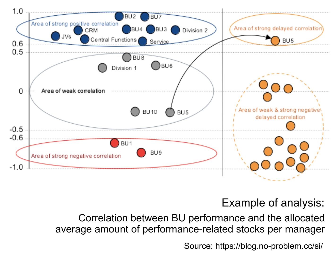 The analysis yields the following results:
- nine organizational units have a strong positive correlation between their performance and allocated stock reward (r > 0.6), which corresponds to the pay-for-performance principle;
- two units have a strong negative correlation between their performance and stock reward (r < -0.6). It is necessary to investigate the reasons.
- four units have weak correlation (-0.5 < r < 0.5), which means these BUs’ performance is not the key factor for their equity allocation;
- the calculated weighted average correlation between BU performance and the average amount of equity allocation on a company level is not strong (r = 0.45), so regression analysis can be skipped.
Here, an additional correlation between two data sets with the shifted starting point has also been calculated. For this delayed correlation the first variable (BU-performance) was used for the data set for four years: from (20XX-5) to (20XX-1), as the second variable (allocated average amount per manager) was applied to the data set from (20XX-4) to 20XX. This parsing shows a strong delayed correlation for one unit, i.e. there is a tendency to correct stocks’ allocation for this BU considering its performance in the previous year.
Results allow us to conclude that the pay-for-performance concept is not equally applied across units in the company. To strengthen the relationship between the granted stocks and units’ performance on a company level an action plan should include digging into specific situations of business units from the weak and strong negative correlation areas to determine other factors influencing the process of stocks’ distribution and possible causes that hinder the application of the pay-for-performance principle.
Quantitative methods are powerful instruments to make educated decisions about processes, data relationships, and causes, and they are not limited to the described ones. The palette of quantitative analysis is very diverse in terms of complexity, frequency of usage, and application areas. The growth of the importance and popularity of big data spurs an interest in quantitative methods of analysis and sprawls the landscape of statistical software. Besides the traditional SPSS, Stata, and Minitab, nowadays the market offers a lot of other commercial and open-source programs, as well as boosts the development of programming languages suitable for statistical computing and graphics, like R, Python, and so on. Appropriate software significantly saves time for a problem-solver and eases the computing of complicated tests and analyses, but does not substitute the necessity of understanding statistical methods and their thoughtful usage.
Read this article on LinkedIn